
Scaling the Amazon Seller Forum for the Future
Modernizing a global community ecosystem through AI-augmented processes and responsive systems thinking.
Role: Lead Product Designer
Problem
The Amazon Seller Forum was a desktop-era product serving an increasingly mobile user base. Sellers (many in regions with limited bandwidth and inconsistent app store access) were navigating dense, search-poor discussion threads on small screens, with no way to follow topics, save threads, or get notified when conversations they cared about evolved. Engagement was flat. Mobile sessions were growing but bouncing.
The team had an opportunity to do more than make the existing forum responsive. We could rebuild it as a platform, one that scaled with seller growth, supported the patterns sellers actually used, and laid foundations the broader Seller Central org could build on.
Modernizing the forum meant treating it as a system, not a redesign. Every decision (platform, feature priority, interaction pattern) had to scale to millions of sellers across regions, bandwidth conditions, and use cases.
Outcome
This work delivered three lasting outcomes:
-
A modernized seller community — a responsive, mobile-first forum that shipped to millions of sellers and improved engagement, adoption, and accessibility across global markets.
-
A scaled community engagement system — transforming the forum into a connected community where sellers could follow expertise, surface trusted peers, and stay close to the conversations they cared about.
-
A modern, AI-augmented design practice — workflows spanning research synthesis, competitive analysis, and interaction-pattern ideation that compressed iteration cycles and became practice I carried forward.
Platform Decision — Native vs. Web
Choosing the foundation that would scale with seller growth and defending it against legitimate executive pressure for native.
Native vs web app exploration
The exploration began with a side-by-side comparison of all core screens using both the web and native design libraries. The goal was to surface the real tradeoffs in cost, consistency, reach, and long-term maintenance. I ultimately decided on a responsive web app rather than a native mobile app, based on the following design findings.
Native app
Vs.
Web app


Web App Rationale
-
Design system fit: Our existing component library was purpose-built for the forum. A native build would have required modifying, replacing, or creating new components within a different library, adding oversight from an external design system team and slowing every future iteration.
-
Cross-platform consistency: Design parity between mobile and desktop was a stated priority for Seller Central. A native build would have fragmented that parity by default.
-
Reach: Past research showed most forum users accessed the platform via mobile browsers, often from regions with limited bandwidth and inconsistent app store access.
Executive Pushback
Executive stakeholders pushed hard for a native app, and two arguments came up repeatedly which were both legitimate. Making the case for web required surfacing new evidence beyond the initial design rationale.
Engagement and brand presence: Leadership cited app store presence, push notification reliability, and parity with competitor seller communities. Native does drive higher engagement for users who install it. To counter this, I went back to the user data and surfaced a different reality:
-
Most forum users were already on mobile browsers, not in app stores.
-
App store access was limited in many seller regions by bandwidth, regional restrictions, and device storage.
-
A native app wouldn't have expanded reach, it would have raised the floor on who could participate.
Reframing the conversation around access shifted the decision from "native vs. web" to "who are we actually building for?"
Long-term investment: A second group viewed native as a strategic investment worth the upfront cost, citing precedent from other Amazon teams and future capability needs. To pressure-test that, I worked with engineering to model total cost of ownership. This meant initial build, but more importantly ongoing maintenance and design system fragmentation:
-
30% slower time-to-market due to device-specific development.
-
40% higher long-term maintenance costs from running separate codebases.
-
Recurring oversight from an external design system team that would slow every future iteration.

Final decision
We aligned on a responsive web app, with a commitment to revisit native if mobile web engagement plateaued or if specific capabilities (deeper push, offline access) became blocking. The decision respected the underlying executive concerns (engagement and long-term value) while choosing the path that served more sellers, faster, with less structural drag on the team.
Strategy & Roadmap
Prioritize features and establish a clear roadmap in order to effectively communicate the design strategy to the team.
System Mapping
Before prioritizing features, I mapped the end-to-end forum, surfacing every touchpoint a seller would interact with, from discovery to discussion to notification. The map revealed which areas of the forum were high-leverage (search, notifications, discussion threads) and which were peripheral, giving the team a shared view of where investment would compound.

Workback plan
I documented the individual features within each section and prioritized them against three criteria: user demand (signal from research and existing forum data), technical cost (engineering effort and dependencies), and strategic value (alignment with the broader Seller Central platform direction).

P0 features (mobile launch)
-
A robust search system allowing users to find relevant threads and discussions quickly.
-
A notification system for real-time updates on followed threads and new activity.
-
Bookmarking capabilities enabling users to save and organize important discussions for easy access.
Deferred to P1:
-
The follow feature. User demand was high, but the technical surface area was significant, touching notifications, feeds, profiles, and visibility preferences. Bundling it into P0 would have compromised either timeline or quality. Elevating it to P1 with proper resourcing was the right tradeoff.
Strategic considerations going into design
-
Limited engineering bandwidth required the MVP to reuse the existing component library wherever possible.
-
Several flows behaved differently on mobile and would require dedicated discovery beyond the initial wireframes.
-
Seller sentiment about mobile-specific needs was still under-researched, a gap the next phase would address directly.
Research and Ideation
Combining moderated interviews with AI-augmented synthesis to surface what sellers needed from a mobile forum.
Process
I ran moderated interviews via usertesting.com with 15 sellers who met our criteria:
-
Amazon sellers for at least one year
-
Frequent users of Seller Central
-
Frequently active on the Seller Central Forum
The interviews were structured around three areas:
-
Current usability pain points and areas for improvement
-
Needs for content discoverability and personalization
-
Notification preferences and engagement strategies
Participants were guided through tasks on the production site and prompted to explain their reasoning aloud, surfacing not just what they did, but why.


AI-augmented synthesis
I built a unified synthesis pipeline in Marvin to process two data sources in parallel: the 15 moderated interview transcripts, and 12 months of forum "complaint" threads (a dataset that had never been properly leveraged for design decisions) provided by forum moderators.
The workflow:
-
Built structured prompts tied to the three research objectives, so output mapped directly to my synthesis goals rather than generic themes.
-
Ran clustering across both datasets to surface dominant patterns, edge cases, and the language sellers actually used to describe their pain points.
-
Cross-validated themes between the two sources. Patterns that appeared in only one or two interviews were confirmed as widespread when checked against the complaint data, and vice versa.
-
Validated AI-surfaced themes against raw transcripts and threads before treating them as findings, guarding against hallucinated patterns.


Key takeaways
Three findings shaped the next phase of design:
-
Sellers valued the ability to customize notifications by following specific threads and sellers — staying updated without being overwhelmed.
-
Quick access to trending topics and critical updates was a higher priority than deep browsing — sellers wanted digestible content, fast.
-
The prioritized P0 features (search, notifications, bookmarking) were validated. Demand for the follow feature was even stronger than expected.
Designing the Mobile Foundation
Translating the desktop forum into a mobile-first experience, guided by principles, refined through testing, and shipped with intent.
Design principles
Before producing wireframes, I set three principles to guide every screen-level decision:
-
Reuse before invention. Limited engineering bandwidth meant the existing component library was the foundation. New patterns had to earn their place.
-
Mobile-first, not mobile-also. Each flow was designed for the mobile context first (short bursts, one-handed use, low-bandwidth conditions) then adapted to desktop, not the other way around.
-
Discovery over depth. Sellers wanted fast answers more than they wanted exhaustive browsing. Search, scanning, and getting back out quickly took priority over deep navigation.
Wireframes
Seven core flows were redesigned for mobile parity: Home, Discussions, Discussion Details, Notifications, Profile, Start a Discussion, and Groups. Each was wireframed at desktop and mobile breakpoints to ensure the responsive system held together end-to-end.


Case study: The Reply button
Replying to a discussion was one of the most-used actions on the forum. In the first round of mobile user testing, sellers consistently flagged the same friction: to reply they had to scroll back to the top of the page, losing their place in long threads. I considered three patterns to solve it:
-
A floating action button (FAB). Standard mobile pattern, but it overlapped thread content and obscured replies sellers were actively reading.
-
A bottom-anchored reply bar. Cleaner, but ate into vertical reading space on small screens.
-
A sticky reply button with a paired "back to top" affordance. Less common, but kept reading space intact and gave sellers a way to navigate the thread without losing context.
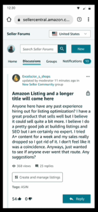
V1 - Scroll to reply
Sellers lose their place in long threads.
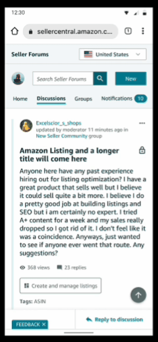
V2 - Reply in reach
Reading context preserved, navigation in reach.
Iteration
I prototyped the third option and tested it in the next round. The pattern hit a 90%+ task success rate and was strong enough to bring back to desktop — the "back to top" affordance shipped on both platforms. This testing → synthesis → iteration cycle ran for each core flow until every one cleared the same 90% threshold.
Handoff and engineering partnership
The handoff was structured around two artifacts working together: the Figma file as the visual source of truth, and a Markdown specification doc that engineers could reference directly in their workflow.
-
Figma MCP integration. I structured the Figma file specifically for MCP consumption (clean component naming, design tokens, Dev Mode annotations, and clear layer hierarchy) so engineers using could easily query designs, components, and tokens.
-
Markdown spec doc. Each P0 flow had a paired MD file documenting interaction logic, edge cases, accessibility requirements, and component dependencies.
-
Living, not static. Both artifacts updated as decisions evolved. When research surfaced the sticky reply pattern, the Figma file and MD spec moved together meaning engineering never built against stale specs.
-
Reviews where they mattered. I kept regular UX/Dev design reviews for the things async docs couldn't resolve: ambiguity, tradeoffs, and edge cases that needed live discussion.


The Follow Feature (P1) — A Case Study in Fast-Follow
Building the most-requested feature on a compressed timeline by treating it as a system, not an addition.
The opportunity
The follow feature was deferred from P0 for technical reasons, not strategic ones. User demand was the highest in the research, confirmed by both the moderated interviews and the 12 months of complaint thread analysis. Once P0 shipped, follow became the highest-leverage next investment: it would directly address engagement, retention, and the "I keep losing track of useful conversations" pain point sellers raised more than any other.
Leadership treated it as a fast-follow meaning a compressed timeline, dedicated engineering, and pressure to ship without the runway P0 had. I treated follow as a system rebuild of how content moved through the forum, not as a feature bolted onto the existing one. That framing shaped every decision that followed.
Mapping the system impact
Before designing any screens, I mapped how follow would propagate through the existing forum, surfacing every touchpoint that would change once sellers could follow threads, sellers, and groups.

The map revealed five core systems that would need to evolve in lockstep:
-
Notifications — needed a new content type for followed activity, plus preference controls to prevent overwhelm
-
Preferences — required new settings for visibility, who could follow you, and notification frequency
-
Home page — needed dual-feed architecture (followed content vs. global content) without fragmenting the existing experience
-
Seller profiles — needed to surface follow/following counts and activity history
-
Popover cards — needed a new component to surface seller metadata and the follow CTA in-context across the forum


Competitive Analysis
Setting the standard
Before designing follow patterns, I needed to understand how mature platforms had solved the same problem. The goal was to identify cross-platform conventions sellers would already recognize, surface gaps competitors shared (which would be opportunities to differentiate), and pressure-test our system map against established product thinking. The challenge was doing this with depth, across multiple platforms, in the timeline a fast-follow allowed.
AI-augmented competitor teardown
I used Firecrawl via MCP to crawl follow-related surfaces across reference platforms (feed structures, profile cards, notification settings, and visibility preferences). The output came back as clean, structured markdown ready for analysis. I fed that into Marvin to cluster patterns across platforms against a comparison framework I'd built around four dimensions:
-
Follow types (threads, users, groups, topics)
-
Feed differentiation (followed vs. global content)
-
Notification granularity and preference controls
-
Metadata surfacing (popover cards, profile previews)
This pipeline let me analyze significantly more competitor surface area than manual review would have allowed in the timeline and let the analysis be structured and comparable, not anecdotal.


Feature analysis
I then went deeper on the follow-specific components and flows that mattered most for our system: how platforms structured their feeds, how they handled notification preferences without overwhelming users, and how they surfaced metadata in-context. The goal was to evaluate each pattern against three criteria: usability, engagement signal, and technical feasibility within our constraints. Below is the feature analysis of follow-related components across LinkedIn, Facebook, Reddit, Instagram, and Quora.


Findings
Three patterns emerged consistently across mature platforms, and each shaped the system we ultimately designed:
-
Notification systems were robust but cautious. Every successful platform had granular preference controls — frequency, content type, who could trigger notifications — to prevent overwhelming users. Building this in from the start (rather than retrofitting it after launch complaints) was non-negotiable.
-
Feed differentiation was universal, but execution varied. Every platform had some way to separate followed content from global content, but the patterns differed: tabs, toggles, separate destinations, algorithmic blends. There was no clear winner — meaning the choice would have to be tested against our specific seller context.
-
Popover cards were the dominant in-context pattern. Across nearly every platform, hovering or tapping a user surfaced a card with key metadata and the follow CTA. The pattern was consistent enough that sellers would arrive expecting it.

Iterative Testing
A research cadence built for fast-follow
The compressed timeline didn't allow for the runway-style research that P0 had. To balance speed with rigor, I built a weekly research cadence: three rounds of unmoderated testing via usertesting.com, each scoped to a single product surface, each feeding directly into the next round of design.

The three rounds:
-
Round 1 — Feed: how followed and global activity would surface
-
Round 2 — Following: the act of following threads, groups, and sellers (including popover card behavior)
-
Round 3 — Notifications: frequency controls and preference defaults
This format gave us the velocity to test, synthesize, and iterate within the fast-follow timeline without skipping the validation that high-stakes decisions required.
Case study: Feed pattern (Toggle vs. Tabs)
Round 1 of testing focused on how sellers would move between followed content and global content on the home page. Two patterns came out of design exploration, and I tested both head-to-head with randomly assigned participants completing identical tasks.
V1 - Toggle
A switch component to flip between followed and global content.

V2 - Tabs
Tabs for sorting between content types.

AI-assisted ideation
Before locking the test variants, I used AI to expand the solution space by generating alternative interaction patterns for differentiating followed vs. global content, drafting label variations beyond "Global" and "Followed," and pressure-testing each pattern against the constraints of our component library. Most options were rejected for the same reasons (component overhead, mobile fit, accessibility), but the exercise surfaced edge cases (like how each pattern would behave when one feed was empty) that shaped the eventual prototype states. The AI didn't pick the patterns. It expanded what I evaluated before user testing arbitrated.
Alternative AI-generated ideations
Option 1 - Dropdown

Option 2 - Copy variants

Option 3 - Header tabs

What testing surfaced
Three issues came out of Round 1 synthesis:
-
"Global" was confusing as a label. Sellers weren't sure what it meant or what content it contained.
-
The toggle pattern read as the wrong component. Sellers expected a toggle to enable/disable a setting, not switch between content views.
-
The transition between feeds was abrupt. Switching states felt jarring, with no acknowledgment that the content was changing.


Iteration
After aligning with the broader EPD org on feedback, I refined the designs and brought them back into the testing cycle. Three changes made the difference:
-
New section header and refined tab labels to clarify what each feed contained, eliminating the "Global" confusion.
-
Tabs as the locked pattern, replacing the toggle. The component matched user expectations and was already supported in the library.
-
A transition state between feeds (added on both desktop and mobile) to smooth the switch and signal that content was loading.
Final section header and refined tab labels

Components that matched user expectations

Smooth transition state between feeds on mobile and desktop

Tradeoffs and Tensions
The fast-follow constraint
Designing follow on a compressed timeline meant trading scope for quality at nearly every stage. Four tensions stood out:
-
Depth vs. breadth of follow types. Sellers wanted to follow threads, sellers, groups, and topics. We cut topic-following (lowest research signal, highest technical cost) with a documented path to add it later.
-
Notification granularity vs. default simplicity. Mature platforms had granular controls, but most users never touched them. We shipped strong defaults with progressive disclosure for advanced controls.
-
Component reuse vs. ideal interaction. Several flows would have been cleaner with new components, but the timeline didn't allow for design system review. I scoped to existing components and flagged the highest-value rebuilds for a future cycle.
-
Speed vs. validation. The weekly cadence kept testing on critical paths, but secondary flows shipped with lighter validation. I documented which surfaces needed post-launch monitoring.
Outcomes & Reflection
What shipped, what scaled beyond the project, and what I'd do differently next time.
Impact
The mobile expansion shipped to millions of sellers and delivered measurable improvements across the dimensions defined at the start:
-
Engagement. Session duration increased 15% post-launch, with the strongest gains coming from mobile users, the audience the project was scoped around
-
Adoption. Combined feature adoption (search, notifications, bookmarks, follow) drove a 25% lift in overall user engagement relative to pre-project baselines.
-
Accessibility. Usability improved 12% in high-traffic, bandwidth-constrained regions, directly addressing the access concern that drove the web-app decision.
What scaled beyond the project
The work outlasted its launch in three ways:
-
The follow-feature pattern was reused in subsequent Seller Central forum initiatives, becoming the reference implementation for cross-system feature design.
-
The component library expanded with new patterns (popover cards, dual-feed architecture, transition states) that other Seller Central teams adopted in their own work.
-
The AI-augmented research workflow (Marvin pipeline, Firecrawl + MCP for competitive analysis) became a practice I carried into subsequent projects and shared across the EPD org. It compressed timelines that previously felt fixed.